Jordan Gibson's A2 media blog
Sunday, 17 January 2016
Saturday, 16 January 2016
Finished Digi-pack.
Finished dig-pack for A2 media coursework.
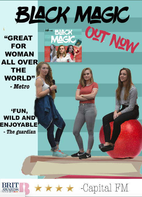
 This dig-pack should act as a guide through the story of the three girls and how they came across their black magic. I have chosen this colour scheme because I want my target audience to be able to relate to it. The colours are very bright create a very feminine and colourful theme. I think this is bright and fun and fits very well with my video. I have chosen to feature an image from the video, and an image from the book, just so that I amiable to create a world that reveals around this story. The fonts are very casual and funky and allow the viewer to relax when looking at them. It carries the connotations for my chosen genre and taggert audience. The characteristics of the images are very stylised and cartoon-used. The apple for instance is a very simple design and adds back to the theme of the fairytale.
Tuesday, 12 January 2016
Making and designing the digi-pack
I first started with the design I had for my advert. Instead of a aqua colour I added a dark
blue and added the words little mix many times to give it a modern and pop like style. However I later didn't like the idea for the dig-pack and changed it to the advert. I took a different photo of the girls and then tried something different. I thought that the eye did not travel enough. I needed a design which was more interesting and something that fitted within my genre and aim towards my target audience more.
I then Placed then on a dark black and purple background. I wanted to have an image of an open book, in front of them so I created beam of light. I painted it using the colours on photoshop and decorated it with small stars. I then cut out an image of paper balls and place them so it looked as if they were flying out of the book. This would give it a school-like feel to it due to where it is set. I used a light white for the title however it did not pop enough nor stick within my genre.

So I replaced it with the same font I have on my advert, creating a link. I place the book on the image and also changed the background to a darker purple. I added the small font of little mix under the book with a light and magical blue. This whole image was much more interesting to me and worked more effectively. I will post an image of all 4 pages of the dig -pack later in time.
However a few days later I had realised that this end product was not what i originally had hoped for. It was slightly tacky and didn't really fit within my genre. I started looking at more albums and digi-packs and gained a few more ideas. I wanted my digi-pack to be colourful and bright and not dingy.
I then created this cover, it was everything I
wanted and I loved it. I gained my inspiration from artists such as taylor swift and Meghan trainer, albums like 'Title' and '1989'.
When looking at different ones, I thought I wanted something quite funky and bright. I looked on the internet and saw this one. I downloaded it and I though it wasn't right. The white was too bright and didn't carry the connotations I was looking for.


Here are some of the other covers.


Subscribe to:
Posts (Atom)


